Recently I’ve seen the vintage typography styling found in Alberta’s mountain parks having a bit of a revival. I’m not sure where it started, but Jasper Brewing Co. has been making great use of a vintage park look, especially in their packaging that lifts its design directly from vintage national park sign systems of yore.
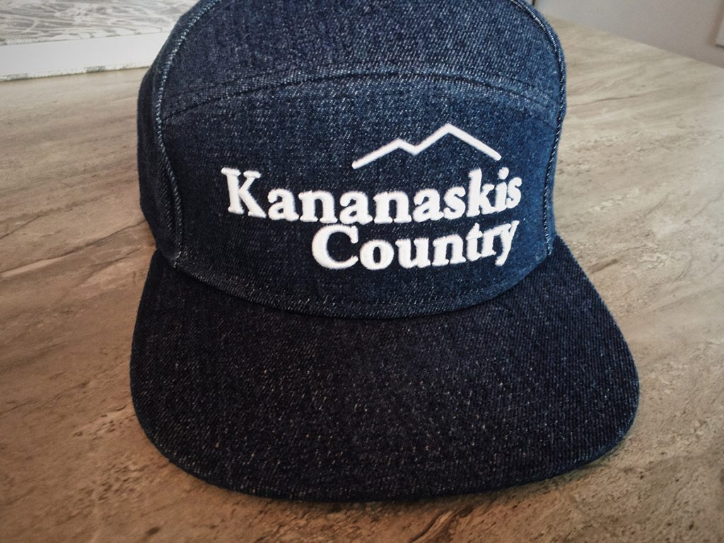
While in Kananaskis over the holidays, I found this hat (which Joanna bought for my birthday, thanks!). I really liked the vintage look of the logo, even if it was missing swashes on the K and y.
So I recently dug up the original Kananaskis Country logo, which is still found on the signs that greet you at the park entrances.
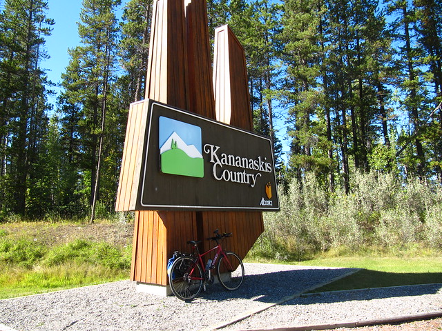
The icon doesn’t do anything for me, but the wordmark is charming. The kerning is too tight for my tastes, especially around the s’s. The typeface appears to be Bookman, and was probably hand-set 40+ years ago by someone in a sign company working for the Government of Alberta.
Then this showed up in my Instagram feed.
Instant purchase for me, so I could spend three minutes making this.
I won’t touch the icon, because what can you really do with mountains, lakes, and trees that hasn’t been done already? But for me, this will henceforth be the Kananaskis Country logo.