…With the hat to match.
A few years ago I passed by a store that had the Woolrich logo on display in the window. I grabbed a picture of it (since lost) because I loved how they used the red and black check pattern for their logo, and combined it with a really modern sans-serif signature.
I’ve been quietly obsessed with it since. I even have plans to do a vehicle wrap with the pattern in the next year.
Anyways, this weekend I was back in that town and picked up a couple of Woolrich shirts. I’ve been on a flannel kick lately, so why not go with the classics?
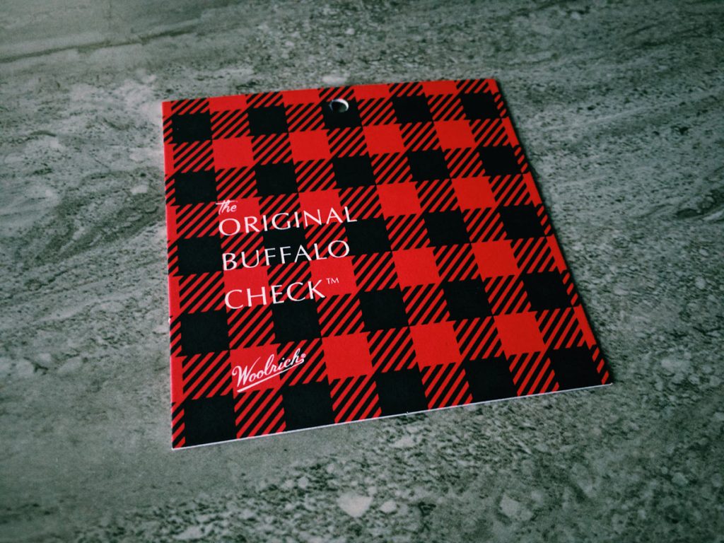
Pictured above is the tag from one of the shirts. Digging around on their site and social media, I see they’re making great use of the pattern, balancing a fine line between classic/heritage and modern/relevant. This gallery from their Instagram has some great examples of how they balance the two.
The final picture in the gallery — the building exterior — is just what I’m thinking.