A man of discerning tastes

In 1986 my mother brought home two boxes: one full of envelopes, the other full of papers. She had a job for me, I was to stuff the envelopes with the papers/brochures (I can’t remember which), and lick them shut. I would be paid a penny for each, and there were literally thousands of them. I toiled away over many days that summer, eventually finishing the job. Weeks later, my mom brought home my pay, $20.00. A princely sum for an 8-year-old in 1986.

I was far from a tastemaker or influencer when I was eight. I always seemed to be behind the curve on whatever was coming down the pipe for kids my age, whether it was Airwolf or trading cards. I was even blindsided by Nintendo, not realizing that was a thing until way too late.

A friend’s brother had this t-shirt, and it was easily the coolest thing ever for a kid in the third grade.

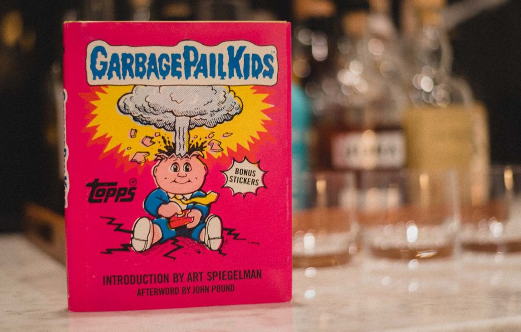
While I wasn’t on the cutting edge of pop-culture at the time, I did have an appreciation for quality when I saw it, and Garbage Pail Kids was an instant must-have for me. Cabbage Patch Kids was a huge thing in 1986, and Topps created this parody of the dolls in response to the doll’s too-expensive licensing fees.

I begged my mother for some, but she steadfastly refused to spend money on such rubbish. “They’re disgusting,” she admonished me.

The only place you could get them was at a shady, dirty, arcade/candy store. In hindsight, it should have been a second home for me, but a lack of disposable income held me back. But not so, when I had all of that envelope money in my hand.

I quickly made my way to the store, money in hand, and Garbage Pail Kids stickers in mind. My disappointment that they were sold out was short-lived. As was the $20. I wasted no time in changing it in for a soda, some candy, and about 72 quarters. 20 Minutes later I walked out, worried what my mother would say about my squandered fortune (she was not impressed).

But 34 years later, I get the last laugh. For just $28.95, I get to own all of them. All things come to he who waits.

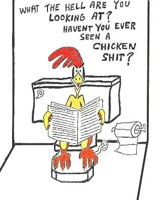
Now I just need to keep my kids away from this trash.

Red and Black Lumberjack

…With the hat to match.

A few years ago I passed by a store that had the Woolrich logo on display in the window. I grabbed a picture of it (since lost) because I loved how they used the red and black check pattern for their logo, and combined it with a really modern sans-serif signature.

I’ve been quietly obsessed with it since. I even have plans to do a vehicle wrap with the pattern in the next year.

Anyways, this weekend I was back in that town and picked up a couple of Woolrich shirts. I’ve been on a flannel kick lately, so why not go with the classics?

Pictured above is the tag from one of the shirts. Digging around on their site and social media, I see they’re making great use of the pattern, balancing a fine line between classic/heritage and modern/relevant. This gallery from their Instagram has some great examples of how they balance the two.

The final picture in the gallery — the building exterior — is just what I’m thinking.

Forever Lake Louise

Lake Louise is easily my favourite place, any season. Winter months have my favourite skiing destination. You can find me on the Larch side, skiing the relatively deserted green runs entirely too fast. But the summer months really shine. Incredibly rewarding hiking trails are there, though most visitors don’t get past the shores of the lake.

Then if you’re willing to venture out from the Chateau grounds, you can visit the destinations nearby. Morraine Lake is a lot like Lake Louise, but even more beautiful. It’s one of the most photographed places in the world, even if it’s become far more difficult to access for its popularity. There are some pretty amazing hikes there as well.

Lake Louise is also at the southern tip of the Icefields Parkway. And if you’re willing to drive a few minutes up there, you’ll find plenty of awesome hikes, breathtaking mountains, and beautiful vistas that don’t see as many tour buses.

Seven questions to evaluate your design

It’s important to go beyond “Is this good,” or “Do I like it” when looking at design work. Here are seven questions that will help determine if that design is actually working.

  1. Is it authentic?
  2. Is it credible?
  3. Does it reflect the client’s personality?
  4. Is it interesting?
  5. Does it have emotional impact?
  6. How does it compare to competitors?
  7. Will it stand out in its intended environment?