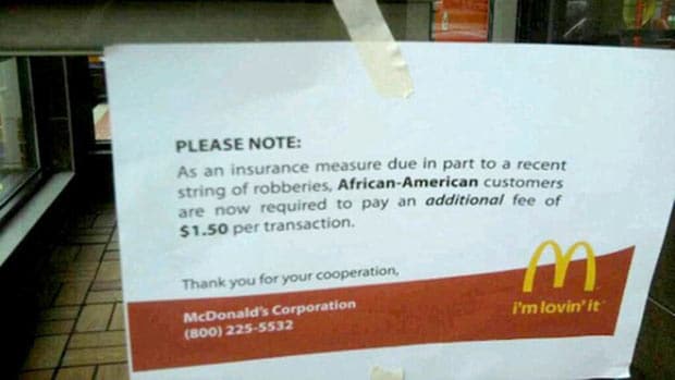
This picture—which is a hoax—has been making the rounds on Twitter lately. Brandchannel has a great write-up on this situation. Aside from the content itself being ridiculous (At the very least, why would McDonald’s alienate a large segment of the audience like that?), the phone number shown at the bottom is for the KFC headquarters.
What I find interesting about this is why people take it seriously. The main reason is that we tend to suspend disbelief when we see things like this online. We assume that someone, somewhere, has taken the time to verify this. We assume that because it exists, it must be true.
The other reason this works is that it looks legitimate:
- The typeface looks correct.
- Everything is lined up properly (with nothing centre-aligned).
- The language sounds like it came out of a head office.
In fact, the only visual clues that suggest that this isn’t legit are the masking tape sloppily tacking the sign up and the odd margins (especially on the right side of the sign).
I’ve found that you don’t have to be a designer or a marketer to be pretty savvy about what looks like legitimate communication. People are very good at sensing when things just don’t look right, at least at a very low level. This is why the email scams are appearing more and more “legitimate” nowadays. It is also why it’s so important for your collateral to be designed to reflect your brand’s promise: your audience can sense when your materials don’t reflect your message.
