Are Logos Important?


What is it that makes a corporate brand identity? I used to think that this meant the logo, but the more I see and the more I practice the design of brands, the more I realize the logo enjoys exaggerated importance in the design of the brand identity.

Bad logos are either aesthetically unsuitable for the brand, or are simply unsuitable for technical reasons (e.g.: reproduction difficulties).

But if the logo isn’t outright bad, it can probably work well in the hands of a skilled designer. I’ve noticed that it’s novice designers who rely the most on a great logo to design good materials, where great designers can make mediocre marks work wonders for the brand.

This is because it’s the overall aesthetic that is created for the brand that really matters. In the end, the logo is really just a tiny aspect of the overall identity. I think it’s easy to see how this works when you start looking for it: have a look at your favourite brand design, how often does the logo really matter? While there will always be exceptions to the rule, you’ll often find that the logo itself has very little to do with the aesthetic given to the brand identity.

In fact, some of my favourite personal work has been done when I hastily applied the client’s logo as a last measure, because I hated the mark so much. I simply designed around it, and everyone was much happier for it.
Nerds, Geeks, and Dweebs in Tech Support


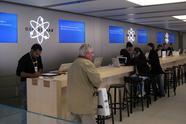
Recently my MacBook started acting up, so I took it in to the Apple store to have it looked at. While there, I realized that there’s a big difference in how different companies brand tech support.

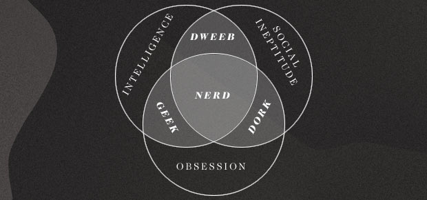
Typically, companies take a kind of tongue-in-cheek approach to their tech-support departments. Best Buy has the Geek Squad. A private Canadian mobile tech support company is called Nerds on Site. Nerds, geeks, and dweebs all make frequent appearances in the names of tech support brands. While the derogatory names are intended in an endearing way, I can’t help but wonder what the effects of this branding is on the way customers relate to the brands.

NYC - Apple Store, West 14th Street - Genius Bar

At Apple, the tech support is called the Genius Bar. It’s a name that achieves similar messaging as the Geek Squad–that these people know their stuff, stuff that you don’t–but without the backhanded insult applied to the people that work there. I also think that this more positive branding prepares everyone, staff and customers alike, for a successful relationship. As a customer, your time with the Apple “Genius” is a little less antagonistic than your time with a “Geek” might be. There’s a more healthy respect in the relationship.

I’m a Professional!


I had intended to join the GDC (Canada’s professional graphic design organization) some time ago. But life, and a frightening application process, kept me from making the effort until recently. While not impossible, joining the GDC at the professional level requires you submit yourself, and your work, to some amount of scrutiny. Enough at least to cause a few stress-filled weeks despite my self-confidence in my practice and abilities.

I’ve just received confirmation that I’ve been accepted as a Professional Certified Graphic Designer with the Alberta North chapter of the Society of Graphic Designers of Canada. I guess that makes me Taylor Garries, CGD. Time to order some new business cards.

What is a CGD?

For practicing designers, including web and new media designers, professional design educators and design administrators with at least seven years of graphic design education and professional practice.

From the GDC website.

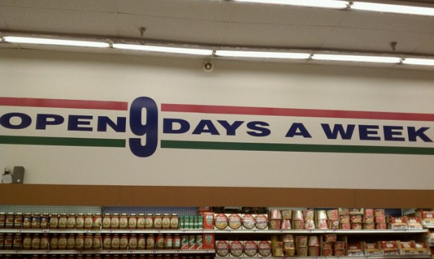
Open 9 Days a Week


I am forever fascinated with the subtle (and not-so-subtle) ways that brands use to strike the right tone in their communications. I love seeing little bits of whimsy in what can otherwise be a sterile landscape. Surprise and delight, I often say, are some of the key elements for building a memorable experience and eliciting passion from your audience.

Michael Bierut’s Best Work


Michael Bierut is a star in the design world. When it comes to practicing designers, he might be one of the best known—and for good reason, too. While his work has received almost every accolade, honour, and mention that the profession has, it’s his insights into the practice of design that I enjoy the most. (His Creative Mornings talk about his clients remains an absolute favourite of mine.)

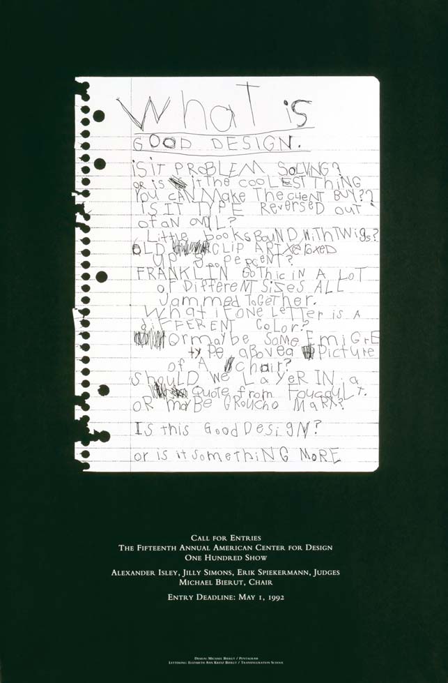
I stumbled across this at HowDesign.com. It profiles Bierut’s all-time best piece of work—a tremendously creative solution to the challenge presented by the project. Like anyone who has mastered his art, Bierut makes it look so simple and easy.

Well, I don’t love it


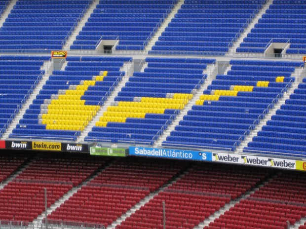
I’ve had to present creative concepts before. While it can be the most rewarding part of the project, often the experience is completely deflating. That’s why I was so taken with this article in The Province that recounts the moment Nike executives got their first look at the now-iconic logo.

When the Nike pioneers caught their first glimpse of the black, curvy checkmark, the graphic designer who created it waited patiently for a reaction.

Nothing. Then, “What else you got?”

Carolyn Davidson, pushing back disappointment that spring day in 1971, pressed on. One by one, she presented a handful of sketches. But ultimately the three men circled back to the checkmark, her favourite.

“Well, I don’t love it,” Phil Knight said at the time, “but maybe it will grow on me.”