Kunming’s Fake IKEA


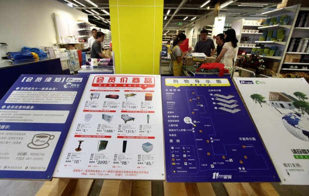
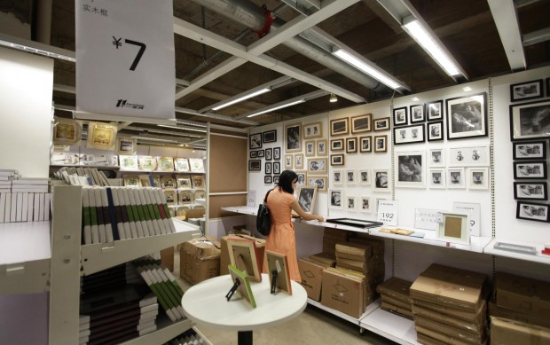
Brandchannel has a good writeup on another of Kunming’s other brand knock-offs: IKEA. The store is called Eleventh Furniture, and its employees have a pretty causal attitude about working for the IKEA knock-off, “If two people are wearing the same clothes, you are bound to say that one copied the other. Customers have told me we look like Ikea. But for me that’s not my problem. I just look after customers’ welfare. Things like copyrights, that is for the big bosses to manage.”

If you took someone from Kunming to visit an IKEA store, would they remark “Hey, this IKEA looks just like Eleventh Furniture”?

Ron Tite’s Case Study on Social Media for Corporations


Over two posts on his blog, Ron Tite has written a crash course for corporations using social media. They work really well as a case study for best practices. The main point: let compassionate humans run your social media, not your legal department, not your marketing department. Be genuine; have character; and engage your audience instead of yelling at them, deaf to their responses.

One of the most common mistakes big brands make is using social media as a one-way bugle that provides a never-ending and piercing stream of infomercial-like offers, deals and promotions. On both Twitter and Facebook, Pizza Pizza excels at this. SM isn’t a commercial. It’s an operational service that listens, responds and keeps people interested and engaged.

  1. Uh oh. Pizza Pizza pissed off the wrong person.
  2. Pizza Nova gets it. Pizza Pizza doesn’t.

Branding Diverse Organizations


I’ve worked on branding projects for companies that have a diverse product offering, and it’s a real challenge to come up with a way to bring everything together under one succinct tagline that has any meaning.

That’s why I’ve liked GE for some time. They came out with their “Imagination at Work” tagline, and it’s done a great job of describing the proposition of the GE brand. This video is a pretty recent brand awareness spot that explains the GE brand in the simplest of terms.

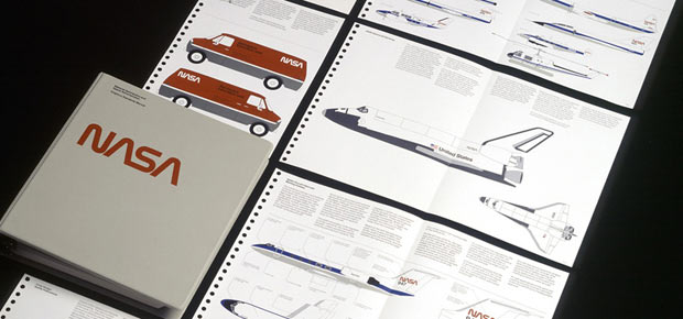
1976 NASA Graphic Standards Manual


I love corporate identity documentation, which is normally a terribly dry thing to love. But this NASA Graphic Standards Manual from 1976 is really exceptional. There aren’t enough details, but I can see how much of this design influenced anything related to space for the next 15 years. From sci-fi movies to my favourite sets of Lego (the early space stuff was tops in my books), looking at these manuals is very evocative. I just wish there was more to see.

Via Aisleone.

Apple Store Knock-offs in China


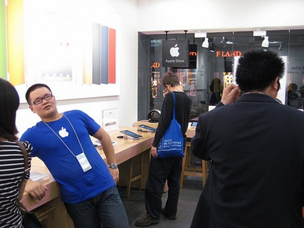
This is already pretty old, but it’s worth seeing regardless. I won’t get into this too much, because others have already done a really good job talking about this (original post | analysis by Brandchannel).

The amount of effort that’s gone into this is impressive; even the employees think they’re legit Apple employees. The BrandChannel post observes that there is a Sony store nearby, and they wonder if anyone considered whether it is a knock-off as well. An odd question, as (based on the last time I was in a Sony store), the experience design in a Sony store is completely unremarkable. Who would want to knock-off a Sony store?

It makes me wonder though, have you ever made something so good, people wanted to steal it?

Top Brands Have Accidental Names


A while ago I realized that there are only two kinds of brand names: unsuitable names and good-enough names. There is no such thing as a perfect name. While unsuitable names can ruin a brand’s chance of success, no name can guarantee a brand’s success. In fact, when you start looking at the most successful brands, their names were often created almost accidentally.

That’s why I liked this graphic I stumbled across recently. It tells the story of how some of the biggest brand names came about. Not one of them was a thoroughly designed name, that branding experts considered perfect.

Pentagram Dresses Drake’s

Once again, Pentagram rolls out some really strong branding work. It’s a fantastic example of what I think of as really great brand identity design: a elegant mark, impeccably applied to the collateral.

It’s exactly what I was thinking about when I asked if logos are important. The logo doesn’t aspire tell the whole story of the brand. It’s “just” a very nice wordmark. Instead, William Russell and John Rushworth (and their teams) build the brand’s visual vocabulary in the collateral.

Make sure you have a look at the interiors (also by Pentagram) on their website.