
Stolen this from Mashable, this info-graphic is an interesting timeline of western typefaces that have shaped the (design) world.
Stolen this from Mashable, this info-graphic is an interesting timeline of western typefaces that have shaped the (design) world.

I had set this aside months ago – when I first saw it – so that I could do a proper write it up. Unfortunately Armin Vit at Brand New beat me to it, writing it up twice(!) a couple of weeks after I first saw it. Nevertheless, this rebranding project is worth sharing, and I’m sure you’ll appreciate it as much as I did.
Moving Brands has really pared down its original case study from what I saw up there, which is a shame. That’s not to say I don’t understand – it kind of blew up for a while there, and the brand manager at HP probably had a few sleepless nights over all the hubbub. This kind of work is usually kept pretty close to the chest, and I’d guess HP is feeling a little exposed.
Nonetheless, the work that was available is really, enviably nice. Here’s a small handful of shots that I grabbed before they disappeared. Hopefully if someone from either HP or Moving Brands sees this, I won’t get into too much trouble.


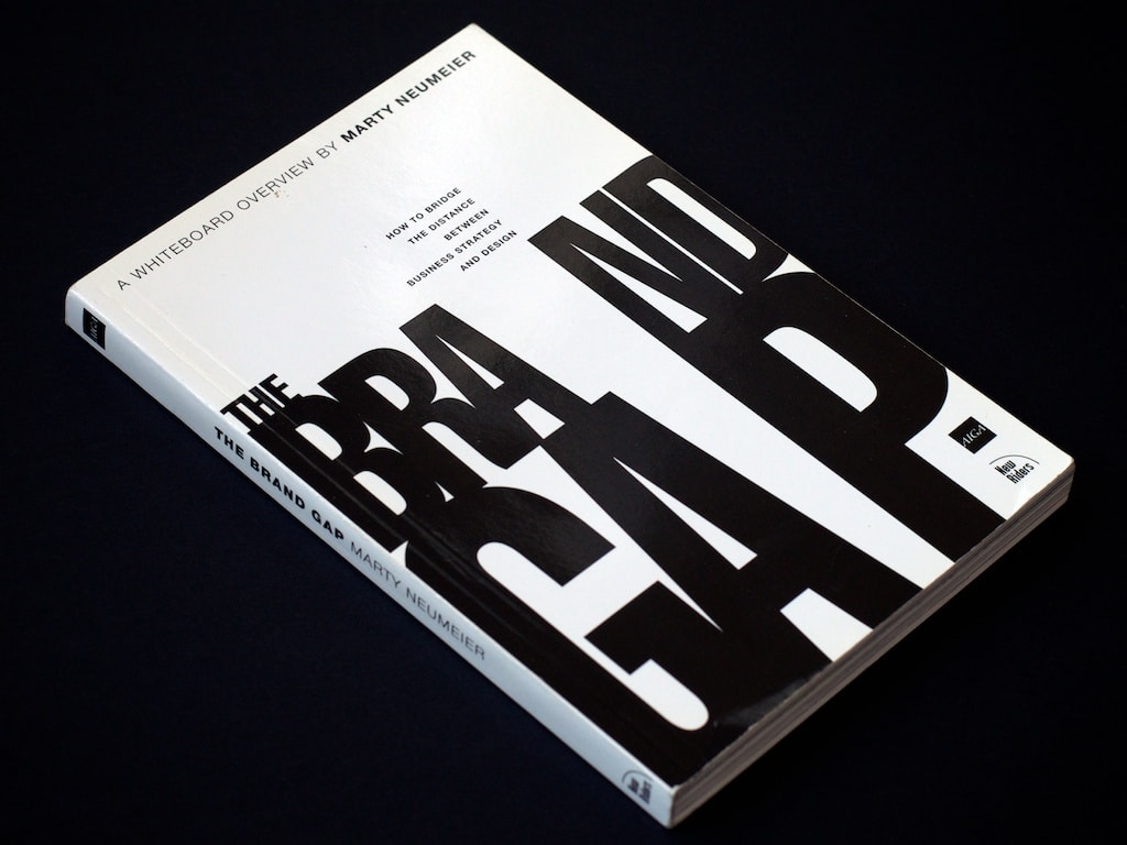
Possibly the best overview of practical corporate branding I’ve ever seen, this book takes your typical “a brand is a promise” lines and gives them real meaning. The exercises in this book are a great starting place for any company wanting to examine its brand. Marty Neumeier has also published Zag, a similarly brilliant look at differentiation, which should also be compulsory reading for anyone thinking about brands.
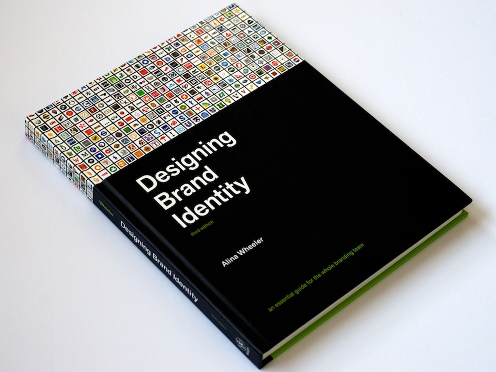
This is the manual for brand identity projects. Not only is it widely acclaimed in the industry’s leading magazines like Communication Arts, but I’ve also seen concepts from this book adapted to the processes of many leading design agencies. Anyone doing branding work should be using this book.

I’m a fan of pretty much anything that acknowledges its media/surroundings and embraces it as a part of the design. Here are four examples of that.
Relevant ad for Ford trucks.

Careerbuilder offers some support to office workers struggling with their work.

Denver Water leads by example.

Clever bag design for YKM department stores (hopefully for their fitness section).

I often have a hard time explaining to clients how modern identity work can be multi-dimensional and dynamic, but I don’t think I’ve ever done a great job of it. But this little video announcing a new logo for the Science Channel is about as good of an example as I can think of.

It’s pretty interesting to see how some of the most famous brand identity work has evolved. It’s pretty rare for any of these companies to completely rebrand, usually there are just some some adjustments made in each iteration.
Post-publishing note: I had grabbed this image from somewhere and stuck into my folder of things to blog about. Unfortunately, I didn’t keep very good notes as to where I found this collection. Tineye didn’t turn up any results, but it appears as though this was originally from Inc.com which has some nice notes for each brand and is worth looking at.

Imprint recently posted a nice retrospective of the Nike logo, which just turned 40. I’m fascinated by this brand identity, which is perhaps the most famous mark in history, yet the work was originally underpaid and unappreciated. As someone who has designed some identities that I really believed in – only to have the client say that they didn’t love it – this story resonates strongly with me.

I love corporate identity documentation, which is normally a terribly dry thing to love. But this NASA Graphic Standards Manual from 1976 is really exceptional. There aren’t enough details, but I can see how much of this design influenced anything related to space for the next 15 years. From sci-fi movies to my favourite sets of Lego (the early space stuff was tops in my books), looking at these manuals is very evocative. I just wish there was more to see.

Not only clever, this fruit juice packaging by Naoto Fukasawa would look distinctive in almost any environment. Toxel.com quotes him:
I imagined that if the surface of the package imitated the colour and texture of the fruit skin, then the object would reproduce the feeling of the real skin.
I’m really interested in how this kind of design affects how people experience the brand. I imagine that the design would certainly allow for a hefty premium to be charged on the product, and the packaging itself to be cherished by its consumers.