This bus ad for the VW Golf makes a clever use of the media to engage the audience’s participation in the message. This is the kind of work the makes ad people say “I wish my clients let me do stuff like that.” The ad reads, “A Golf is up to 10% cheaper to run over 3 years than the competition. It’s true, no need to shake your head.”
Month: July 2011
Brand Reversions by Graham Smith
Graham Smith has done a masterful job of mashing up two logos, often from competing brands. It’s a fascinating look at brand identity design, and raises questions about the relative importance of the name and the design.
Great Ad Placement
Sometimes ad buys work out really well. I wonder if this was an intentional move by the media buyer and creative, or just a moment of serendipity?
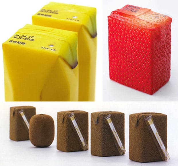
Really Clever Fruit Juice Packaging
Not only clever, this fruit juice packaging by Naoto Fukasawa would look distinctive in almost any environment. Toxel.com quotes him:
I imagined that if the surface of the package imitated the colour and texture of the fruit skin, then the object would reproduce the feeling of the real skin.
I’m really interested in how this kind of design affects how people experience the brand. I imagine that the design would certainly allow for a hefty premium to be charged on the product, and the packaging itself to be cherished by its consumers.
Ameriquest Understands
I won’t comment on how these commercials impact the Ameriquest brand; they’re several years old and require a lot more context to fully appreciate. But it’s clear that these would have been really fun for the ad agency to produce, and they do a good job of providing entertainment in exchange for the commercial message.
Top Brands Have Accidental Names
A while ago I realized that there are only two kinds of brand names: unsuitable names and good-enough names. There is no such thing as a perfect name. While unsuitable names can ruin a brand’s chance of success, no name can guarantee a brand’s success. In fact, when you start looking at the most successful brands, their names were often created almost accidentally.
That’s why I liked this graphic I stumbled across recently. It tells the story of how some of the biggest brand names came about. Not one of them was a thoroughly designed name, that branding experts considered perfect.
Pentagram Dresses Drake’s
Once again, Pentagram rolls out some really strong branding work. It’s a fantastic example of what I think of as really great brand identity design: a elegant mark, impeccably applied to the collateral.
It’s exactly what I was thinking about when I asked if logos are important. The logo doesn’t aspire tell the whole story of the brand. It’s “just” a very nice wordmark. Instead, William Russell and John Rushworth (and their teams) build the brand’s visual vocabulary in the collateral.
Make sure you have a look at the interiors (also by Pentagram) on their website.
Vivident Gets a Little Weird
While advertisers like Skittles have employed the method (successfully) for years, I think Old Spice kicked off a fad amongst ad agency creatives: they all seem to love the idea of the bizarre storyline in their ads. The worst offender, I think, is Dairy Queen, who doesn’t seem to understand the how or why of this method of storytelling, but instead comes off like a 4 year old kid try to tell a dirty joke they don’t quite get.
Vivident does a good job of tying the concept back into their brand promise to make the whole effort worthwhile.
H2Oh! Tells a Great Story
Terry O’Reilly talks often about the implicit agreement that exists in advertising: viewing an ad is payment for entertainment. Put another way, advertisers are responsible for entertaining the audience they advertise to.
H2Oh! shows that they understand this reciprocation in this ad. This is the kind of work that the audience will actively seeks out. It’s unfortunate that we rarely see this much effort put into entertainment outside of the Superbowl.
One last thought: notice that you’re not hit over the head with the product placement. The soda makes subtle appearances throughout the spot, and each one feels natural.
Virgin Adds Hashtags to Aircraft
Here’s a clever way to show that you’re in-touch with your audience. The best part of this is that there’s no explanation or instruction: you either know exactly what that means or you don’t.


