What else can be said?
Category: Observations
Cleverness 9
I’ve been saving these for a lot longer than I should. Some of them are a little old already.
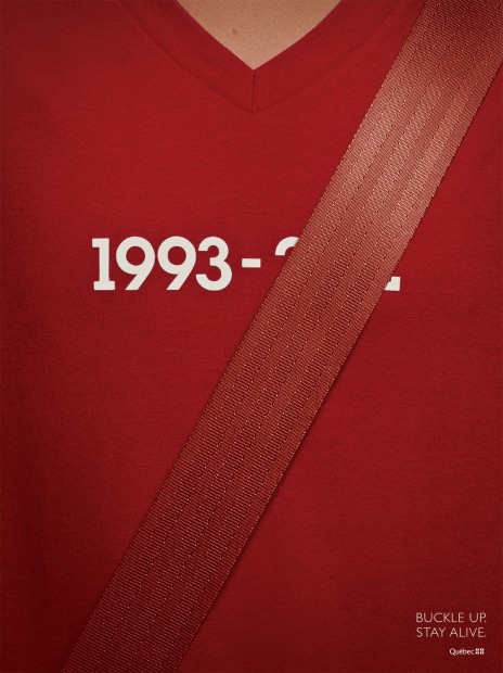
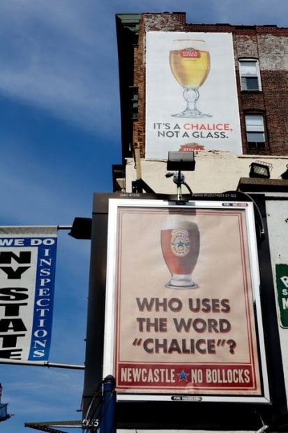
This was a really popular ad that made the rounds recently.
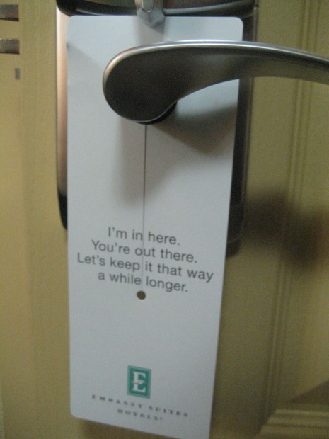
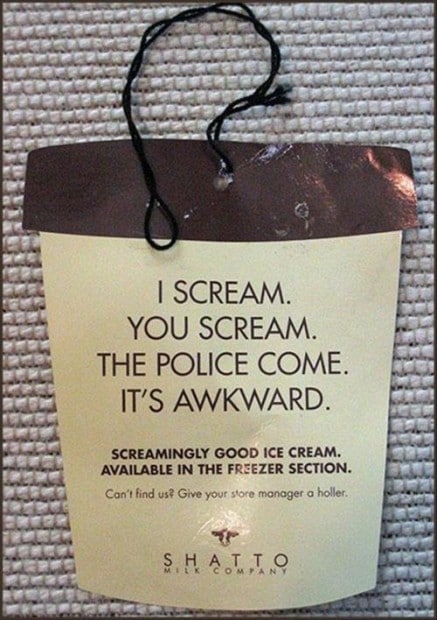
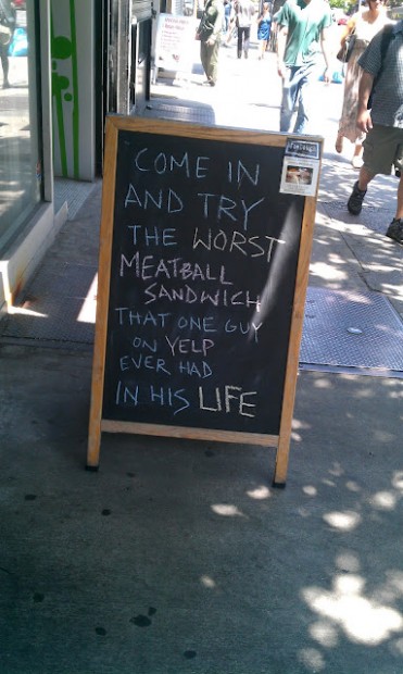
These little touches – where the brand is given a voice that’s unexpected – have a huge impact on our experiences, and cost next to nothing.
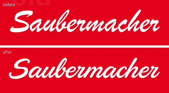
Freshening Up an Old Logo
Typejockeys has a writeup on their blog of their work to re-work this logo for a large Austrian waste management company. I like this as a great example of work you can do cleaning up a logo. Often when we think of conducting a branding exercise, people think a new logo is going to be implemented, but it doesn’t have to work like that. Many times the better idea is to polish up the existing logo: refine the design into something more appropriate to the brand’s objectives.
Bodyform Talks Straight About the Period
Bodyform Maxipads created this great video in response to a Facebook post that calls them out – humourously – for not accurately portraying the experience of a woman’s menstrual cycle. It’s great to see this kind of tongue-in-cheek, fun responses from a major brand; it gives the brand character and builds the brand’s believability.

Lamborghini Countach, an Outrageous Design
This fascinating video outlines just how poorly – and beautifully – designed the Lamborghini Countach is. I like this as an example of how to break the rules of design, using wretched excess.
Cleverness 8
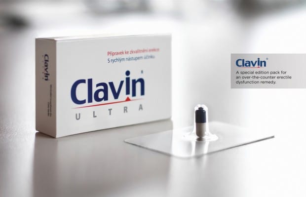
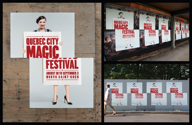
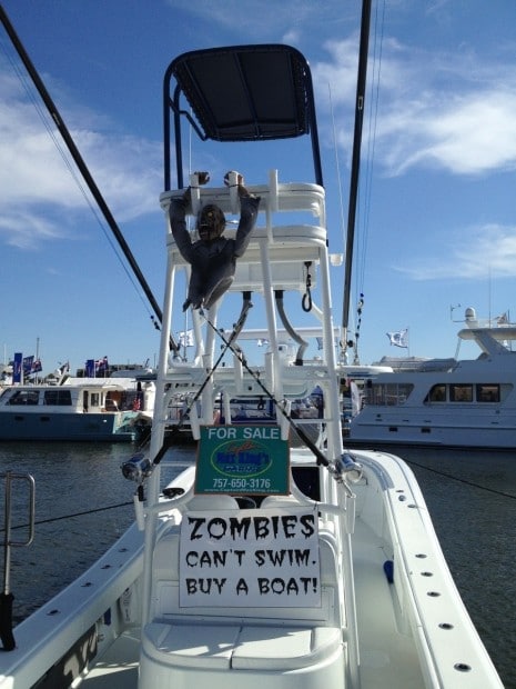
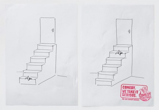
Another collection of really clever advertising or creative work from around the web.
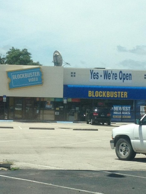
Consumer confidence at all-time lows.
From the Barcelona Metro.
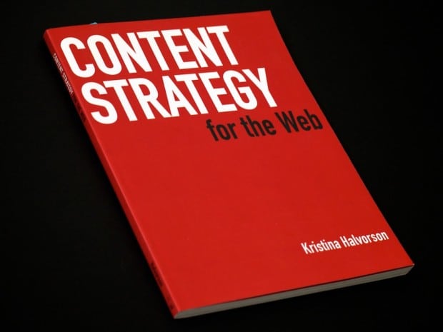
Content Strategy for The Web
This book is aimed at helping teams tasked with managing larger websites get a handle on the content they work with. The book has an effective way of auditing the existing content, so you can make better plans for new content. One section that I really liked advocated the use of website style guidelines for content; a powerful tool for keeping your messaging tight and consistent.
