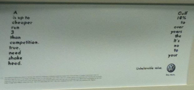
This bus ad for the VW Golf makes a clever use of the media to engage the audience’s participation in the message. This is the kind of work the makes ad people say “I wish my clients let me do stuff like that.” The ad reads, “A Golf is up to 10% cheaper to run over 3 years than the competition. It’s true, no need to shake your head.”
Tag: Funny
Ameriquest Understands
I won’t comment on how these commercials impact the Ameriquest brand; they’re several years old and require a lot more context to fully appreciate. But it’s clear that these would have been really fun for the ad agency to produce, and they do a good job of providing entertainment in exchange for the commercial message.
Vivident Gets a Little Weird
While advertisers like Skittles have employed the method (successfully) for years, I think Old Spice kicked off a fad amongst ad agency creatives: they all seem to love the idea of the bizarre storyline in their ads. The worst offender, I think, is Dairy Queen, who doesn’t seem to understand the how or why of this method of storytelling, but instead comes off like a 4 year old kid try to tell a dirty joke they don’t quite get.
Vivident does a good job of tying the concept back into their brand promise to make the whole effort worthwhile.
H2Oh! Tells a Great Story
Terry O’Reilly talks often about the implicit agreement that exists in advertising: viewing an ad is payment for entertainment. Put another way, advertisers are responsible for entertaining the audience they advertise to.
H2Oh! shows that they understand this reciprocation in this ad. This is the kind of work that the audience will actively seeks out. It’s unfortunate that we rarely see this much effort put into entertainment outside of the Superbowl.
One last thought: notice that you’re not hit over the head with the product placement. The soda makes subtle appearances throughout the spot, and each one feels natural.
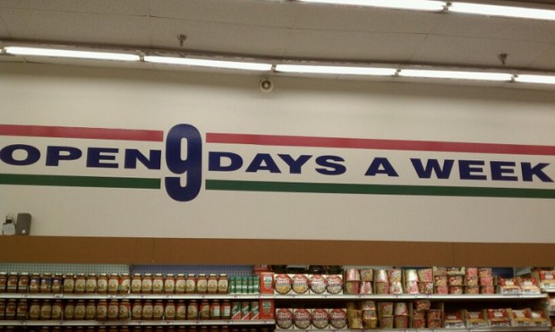
Open 9 Days a Week
I am forever fascinated with the subtle (and not-so-subtle) ways that brands use to strike the right tone in their communications. I love seeing little bits of whimsy in what can otherwise be a sterile landscape. Surprise and delight, I often say, are some of the key elements for building a memorable experience and eliciting passion from your audience.
Well, I don’t love it
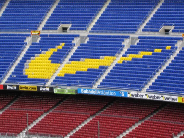
I’ve had to present creative concepts before. While it can be the most rewarding part of the project, often the experience is completely deflating. That’s why I was so taken with this article in The Province that recounts the moment Nike executives got their first look at the now-iconic logo.
When the Nike pioneers caught their first glimpse of the black, curvy checkmark, the graphic designer who created it waited patiently for a reaction.
Nothing. Then, “What else you got?”
Carolyn Davidson, pushing back disappointment that spring day in 1971, pressed on. One by one, she presented a handful of sketches. But ultimately the three men circled back to the checkmark, her favourite.
“Well, I don’t love it,” Phil Knight said at the time, “but maybe it will grow on me.”
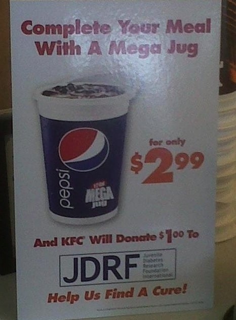
Pepsi Mega Jug for Diabetes
I believe this came from KFC. I think about all of the people who worked on this endeavour: the person who came up with the idea, the designer who laid out the artwork, the sign maker/printer who created it, and the people who installed it. I think about them and wonder: Was the irony of selling massive servings of sugar-water to raise money for diabetes research lost on any of them?
Sometimes, People Will Believe Anything
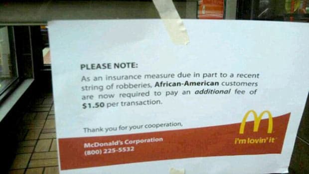
This picture—which is a hoax—has been making the rounds on Twitter lately. Brandchannel has a great write-up on this situation. Aside from the content itself being ridiculous (At the very least, why would McDonald’s alienate a large segment of the audience like that?), the phone number shown at the bottom is for the KFC headquarters.
What I find interesting about this is why people take it seriously. The main reason is that we tend to suspend disbelief when we see things like this online. We assume that someone, somewhere, has taken the time to verify this. We assume that because it exists, it must be true.
The other reason this works is that it looks legitimate:
- The typeface looks correct.
- Everything is lined up properly (with nothing centre-aligned).
- The language sounds like it came out of a head office.
In fact, the only visual clues that suggest that this isn’t legit are the masking tape sloppily tacking the sign up and the odd margins (especially on the right side of the sign).
I’ve found that you don’t have to be a designer or a marketer to be pretty savvy about what looks like legitimate communication. People are very good at sensing when things just don’t look right, at least at a very low level. This is why the email scams are appearing more and more “legitimate” nowadays. It is also why it’s so important for your collateral to be designed to reflect your brand’s promise: your audience can sense when your materials don’t reflect your message.
Ferd F-Teenthousand
This is a pretty funny sendup of the TV spots auto manufacturers use to sell pickup trucks. These things start as satire, but they inevitably end up in the actual commercials.
Trucktober. Coming to a dealership near you.
A pitch-perfect beer commercial
http://www.youtube.com/watch?v=Ubyvz9cbZFU
Hey every other single beer brand ever, how does your commercial playing tired male sexual stereotypes against female ones feel now? Pretty inadequate, huh?
‘Nuff said.
It kind of reminds me of DQ’s latest spots, which use a similar concept.
http://www.youtube.com/watch?v=-VtH5xdbMtU
